Redesigning Australia's largest superfund app
How I led the design evolution of the AustralianSuper mobile app over six years — rebuilding its foundations, introducing a design system, and shipping new features that measurably changed member behaviour.
Product Design, Design System, UX Design
2017–2023 | Millipede AKQA
A fragmented app with no system holding it together
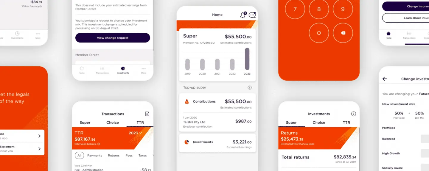
In 2017, AustralianSuper was beginning to step into the mobile app space. Members were logging into a desktop browser a few times a year with little reason to engage more often. The brief was clear: build a mobile-first engagement channel that gave members a reason to interact with their super regularly. By 2021, a new challenge had emerged. The app had been built by rotating freelance designers, with no shared system or documentation. When AustralianSuper underwent a full brand redesign, we were left with inconsistent patterns, visual debt across hundreds of screens, and accessibility issues that were failing our own standards.
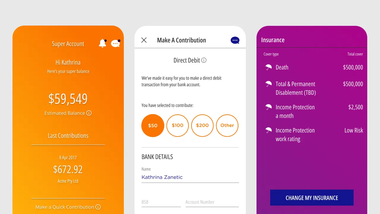
AustralianSuper app screens as designed in 2017.
What I personally owned
Over six years my role grew from team designer to design lead. Here's what I was directly responsible for on the 2021–2023 redesign:
To an extent it worked, but we had another thing catching up fast to us. In 2021, we got word of a whole new brand redesign and we would have to push this design through to the current app.
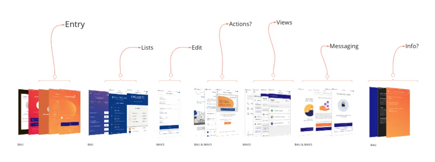
Diagnosing the entirety of the app revealed incomplete patterns, and inconsistency in visuals and experience flows — issues which retracted giving our customers the most optimal AustralianSuper experience.
Window of opportunity
Taking a step back, we saw this as an opportunity to reevaluate the app's development, learn from our past experiences, and kick off a fresh design approach for a major upcoming release. We took user feedback to heart and identified a few key areas that needed some TLC: inaccessibility, usability hiccups, and keeping up with the competition. With a solid plan in place, we were ready to tackle these challenges and give the app the refresh it deserved.
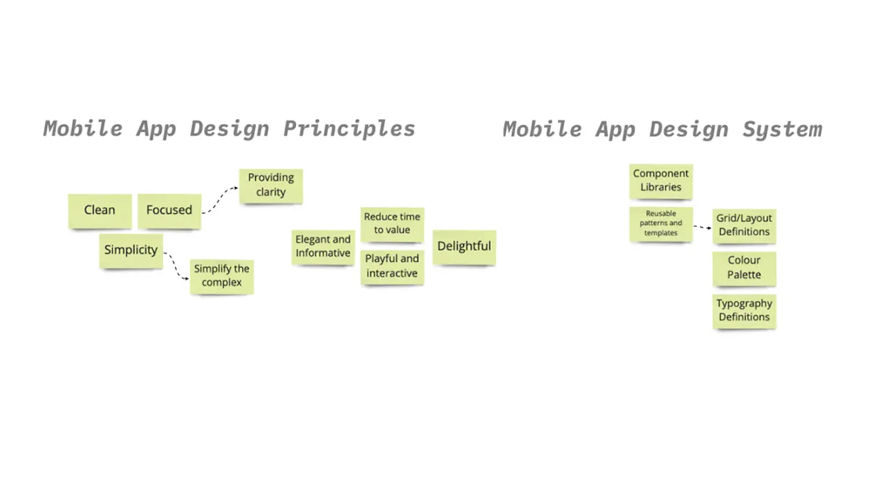
To steer our work in the right direction, we came up with new design principles that put structure upfront. These goal posts helped us systematically rebuild the app and bring our vision to life.
When considering the redesign, I explored several options, including layouts that utilized overflow properties and two-column grids to optimize mobile screens, as well as simpler, one-column designs. After evaluating these options, I recommended the simpler approach for several reasons:
- Older users at the time found the Quick Contributions, which had overflow properties, difficult to interact with.
- One column layout for lower readability friction — anticipating easier tap spacing for older customers.
- I thought about the idea of shuffling cards, a dashboard where you can add more items into it or take items away if needed — something modular and interchangeable.
And thus the simpler, and modular design won out and proceeded to trial and iterate.
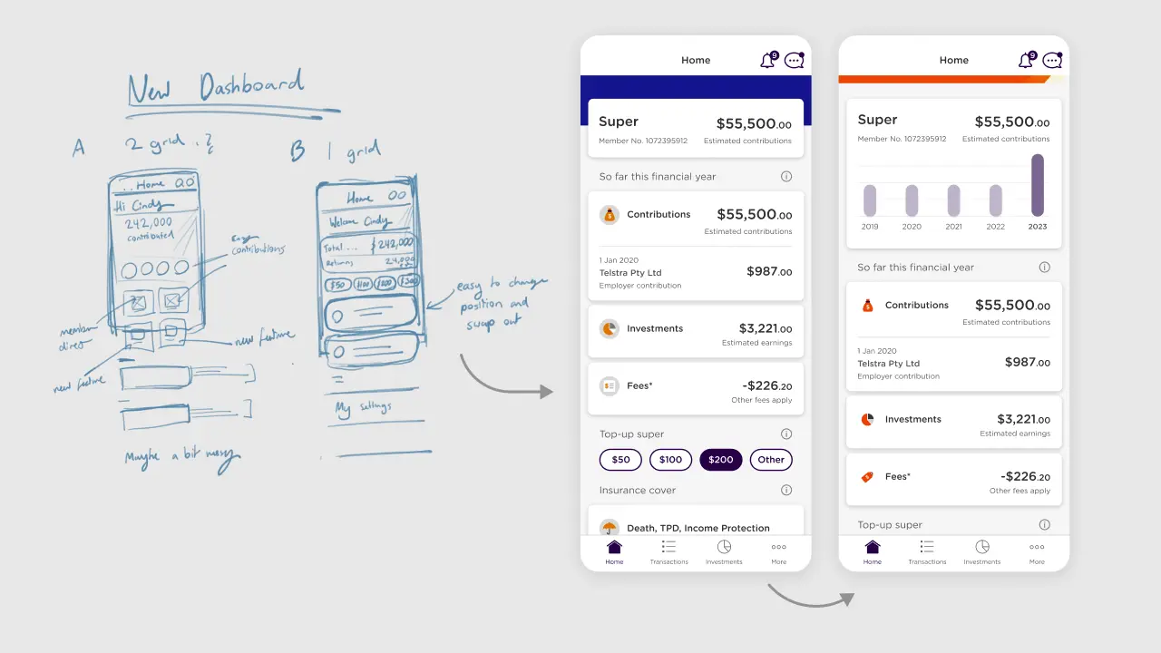
The evolution of the dashboard and following patterns arose from anticipating new features and creating a pattern that allowed new features to be slotted in, allowing the home screen to be key navigation hub.
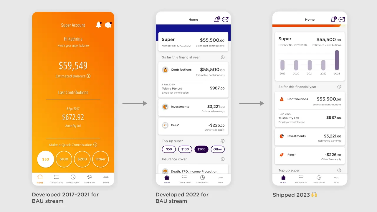
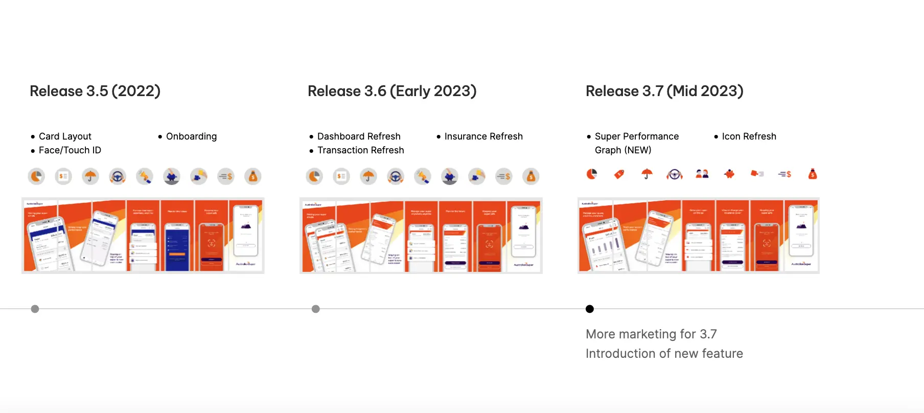
In collaboration with AustralianSuper’s service design team, we implemented a strategy for rolling out new designs over the span of 2 years. Recognizing the potential challenges of introducing significant changes to the user experience, particularly for our older audience, we opted for a gradual approach.
Zero to hero: fixing the design with a system
Touching up on foundations
I dove into the app and took note of all the design elements - font sizes, colors and spacing. After getting a clear picture, I started working on revamping these core design foundations.
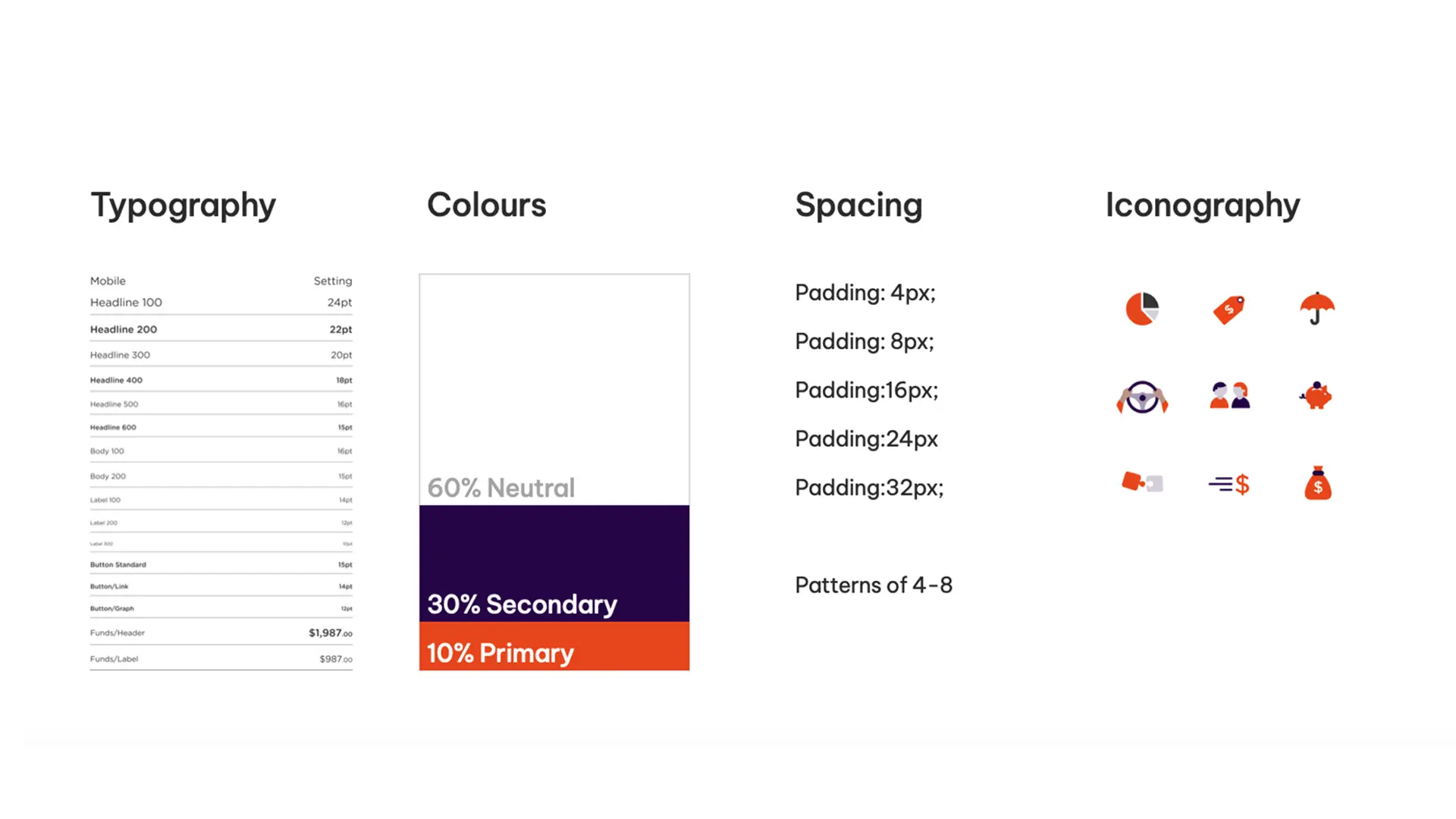
Tweaking spacing and color was smooth sailing, but getting typography sizing just right took some serious trial and error due to how the design relied heavily on the font density.
simplified to
accent-80
dusk-80
concrete-60
concrete-00
We executed the following to improve the state of the designs at the time:
- Re-established the foundations of spacing, colours and typography.
- Phased out the older brand elements such as gradients, and limited the colour palette to reduce visual clutter.
- Defined consistent design patterns and ensured digital interactive elements passed WCAG 2 AA standards.
- Enhanced content hierarchy, readability by refining the spacing and typography.
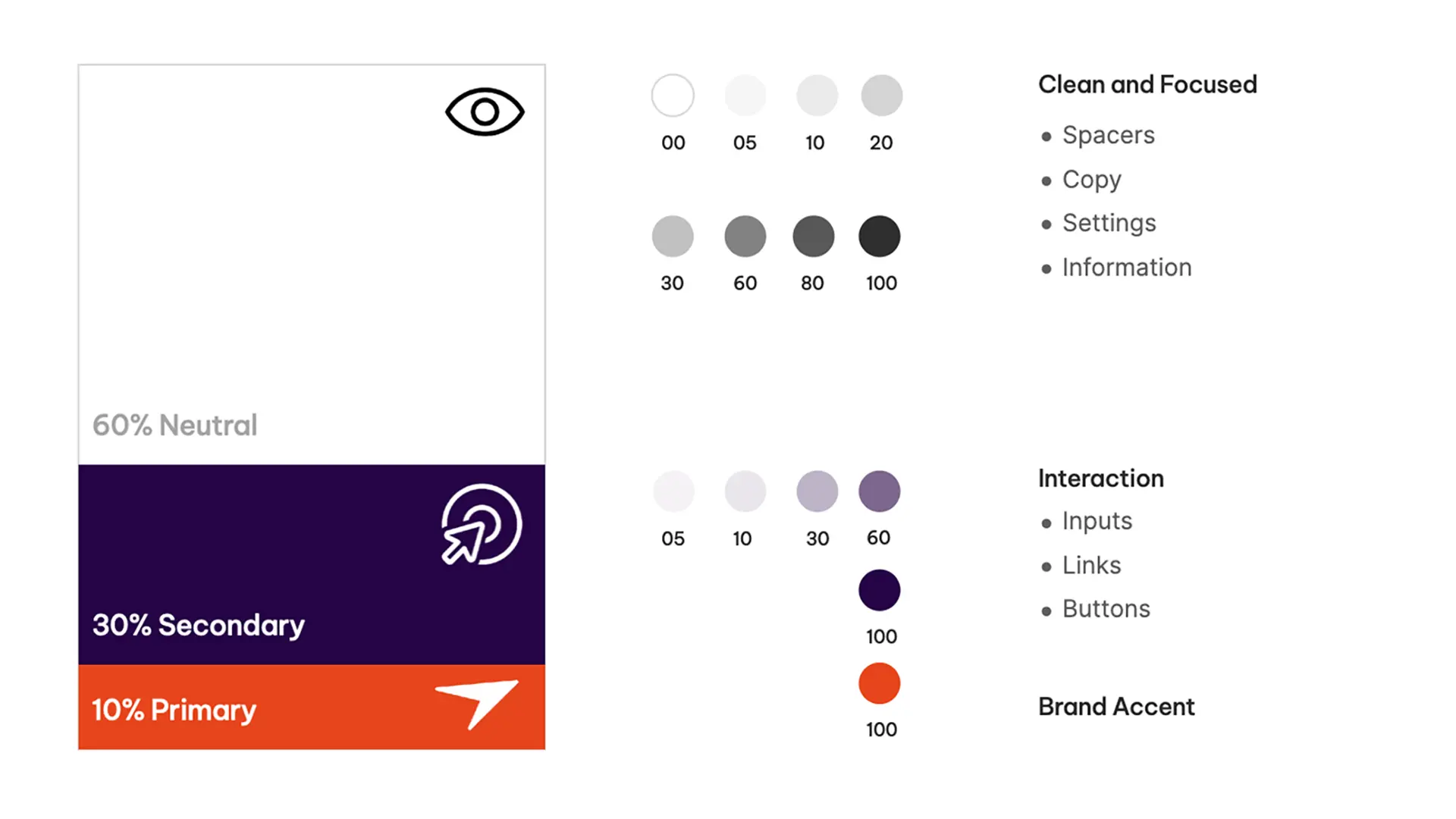
Crafting a language for the use of the colours helped to create a systematic approach for new features and designs.
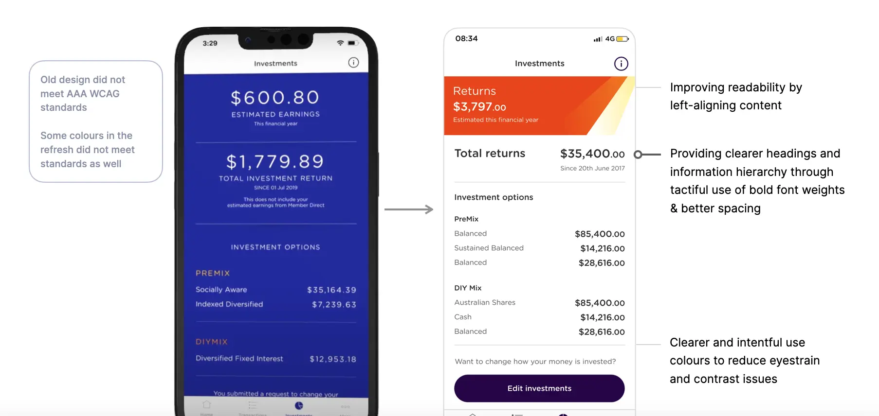
These intentional tweaks paved the way for clearer content structure, stronger brand expression, and enabled users to scan content more efficiently, ultimately leading to a more cohesive and modern app experience that belongs in 2023.
Developing the Super Performance feature
A visual overhaul is one thing, but its another to say we're doing better for our users. To really take advantage of these updates, we wanted to make a statement. In the front, we're delivering capability and improvements, and under all that, we're catching up to competition and continuing to deliver a real-time super experience.
We planned to release a new way to interact with your super with an interactive graph. Users can tap a bar to see their current and past statements in app with details including fees, insurance and contributions.
At first, we considered placing these elements in a separate section of the navigation bar. But we found that having more than four tabs could make the layout cramped and require compromising minimum tap points.
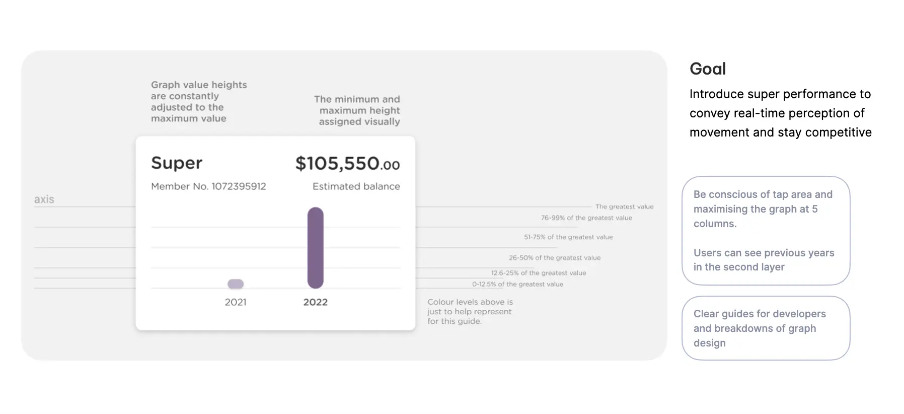
The modular design pattern let us fit the feature into the dashboard, making it prominent while keeping the experience undisturbed.
To help visualise and map the possible journeys of using this feature, I created stories— imagining and roleplaying different circumstances whether a person has a higher contribution one year, if they've only been a user for less than 1-2 years etc.
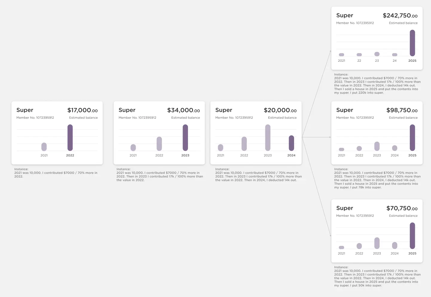
I crafted stories of how different users would have interacted with the feature, anticipating and navigating what-ifs and role-playing pathways.
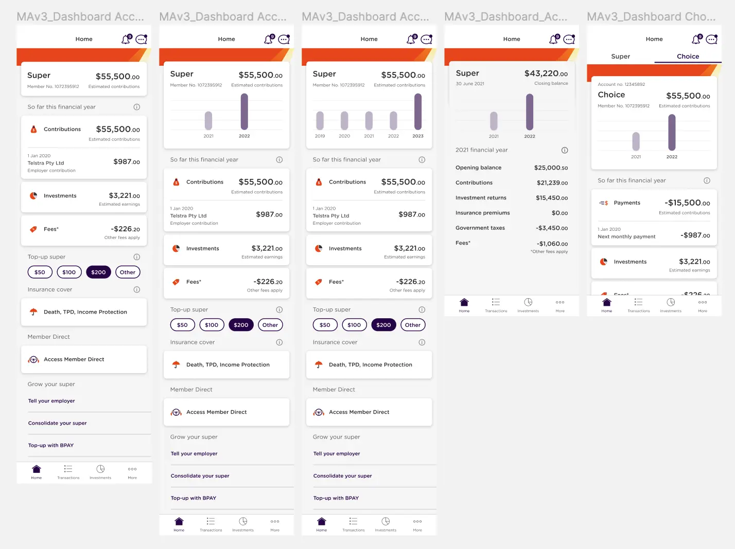
These annotations and scenarios helped stakeholders at AustralianSuper understand how this feature worked and gained endorsement. Additionally, those same notes and guides also helped the engineers create this feature.
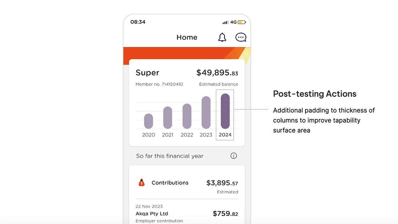
One feedback we did implement was making the graph pills wider than the original design. It was found during user-testing, that the tap surface needed to be larger as testers were struggling to tap the pills. This was a quick turnarond and deployed to the final release.
Making the pitstops to release
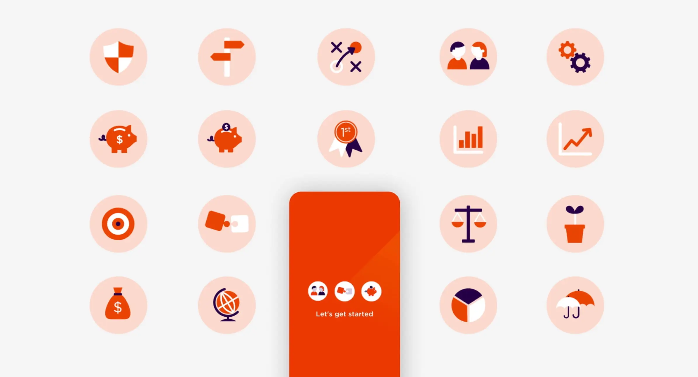
After refining the design foundations, we decided to further improve release 3.7 by updating the icons, completing the set. I made a case to the team to include these new icons in the larger release alongside the super performance graph. Coordinating this effort helped create a more significant impact and took advantage of the increased marketing budget for version 3.7.
